TECH EX 002
KEY CONCEPTS IN LRC FILE MANAGEMENT: Import photos, Workflows, Workspace, Viewing photos, Manage catalogues, collections and files, Work with photo collections
TECH EX 003
LRC BASIC EDITING – Develop Module Basics – Apply Local Adjustments
Before and After for: Colour
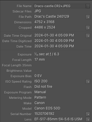
EXIF Data
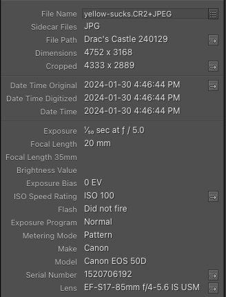
Before and After for: Line
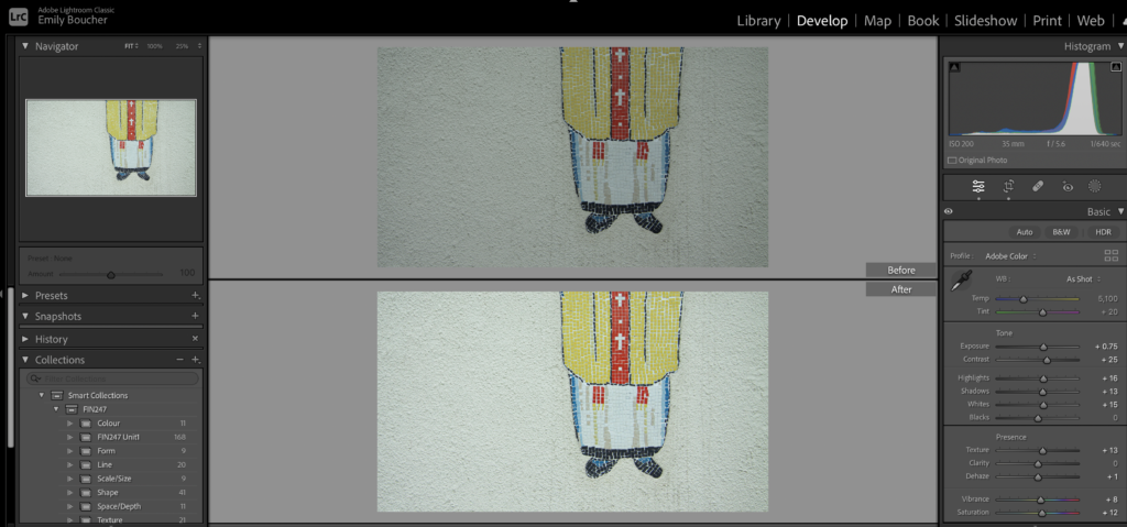
EXIF Data
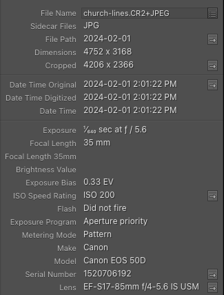
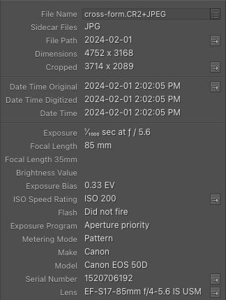
Before and After for: Form
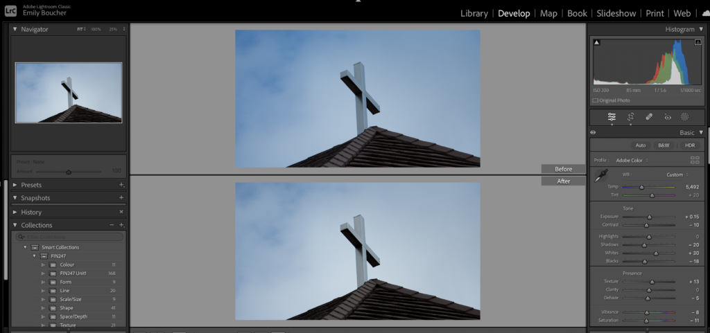
EXIF Data
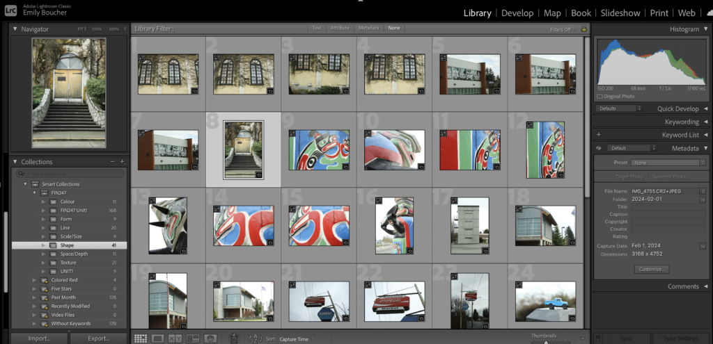
Before and After for: Shape
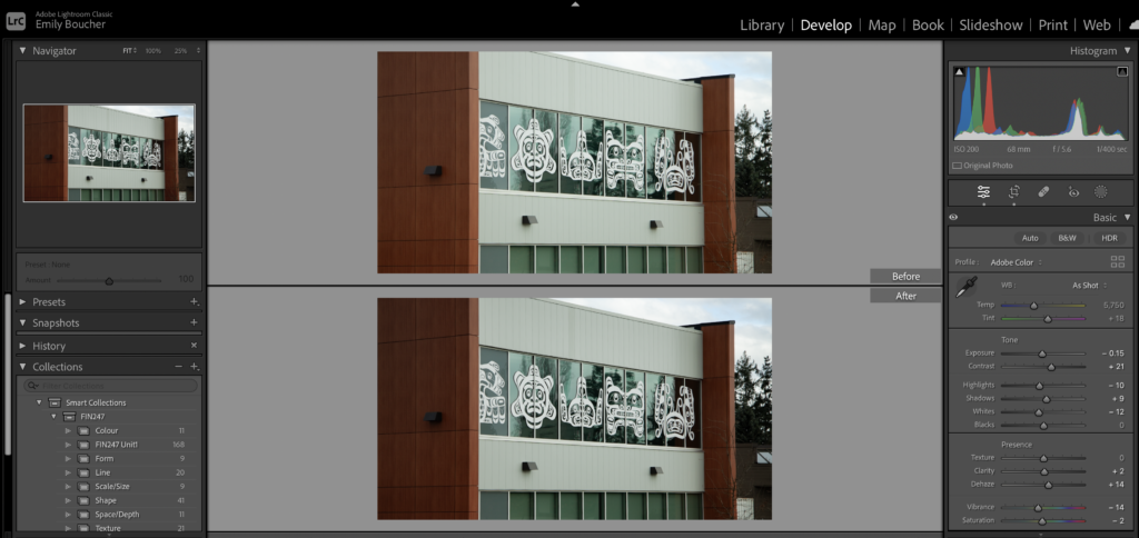
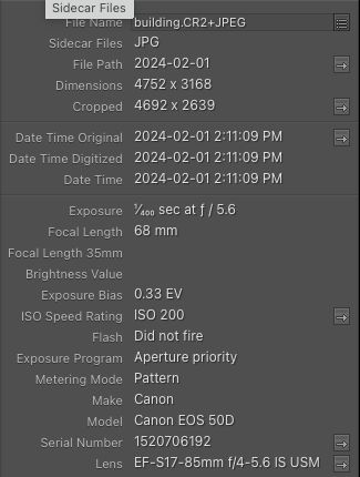
EXIF Data
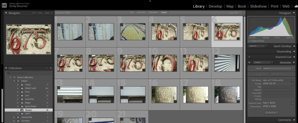
Before and After for: Texture
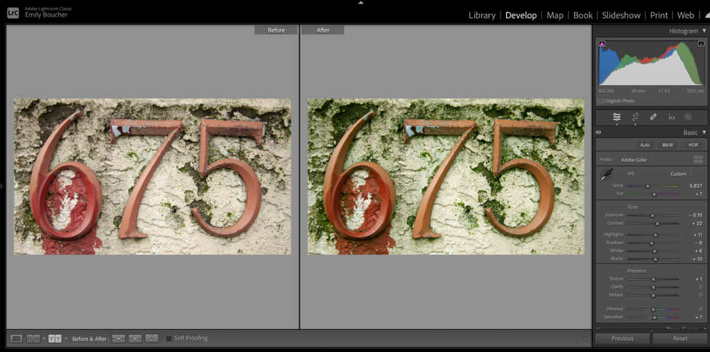
EXIF Data
Before and After for: Size and Scale
EXIF Data
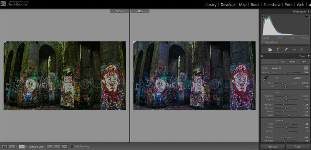
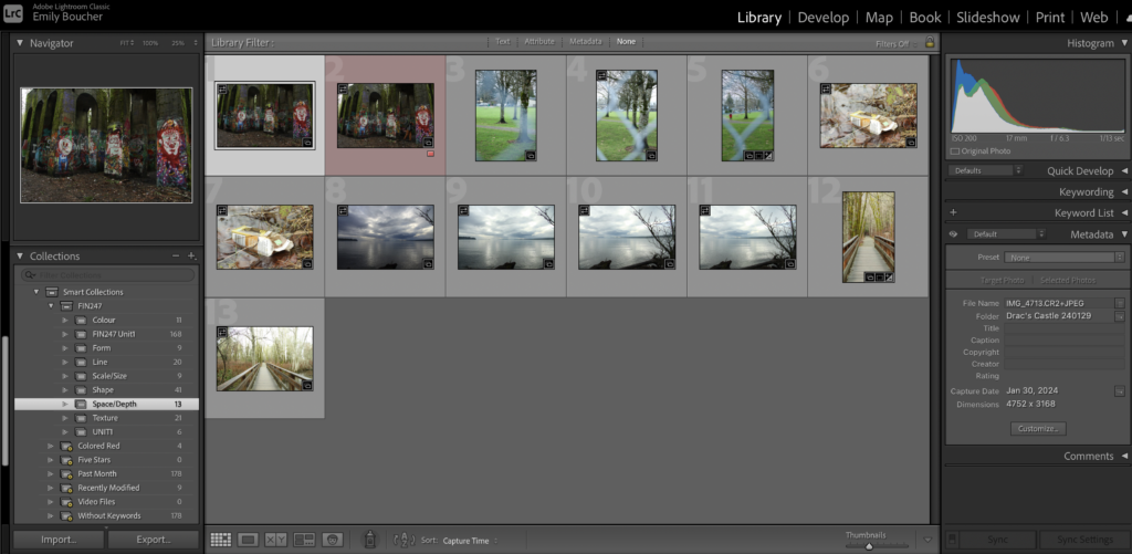
Before and After: Space/Depth
EXIF Data
Tech EX 04
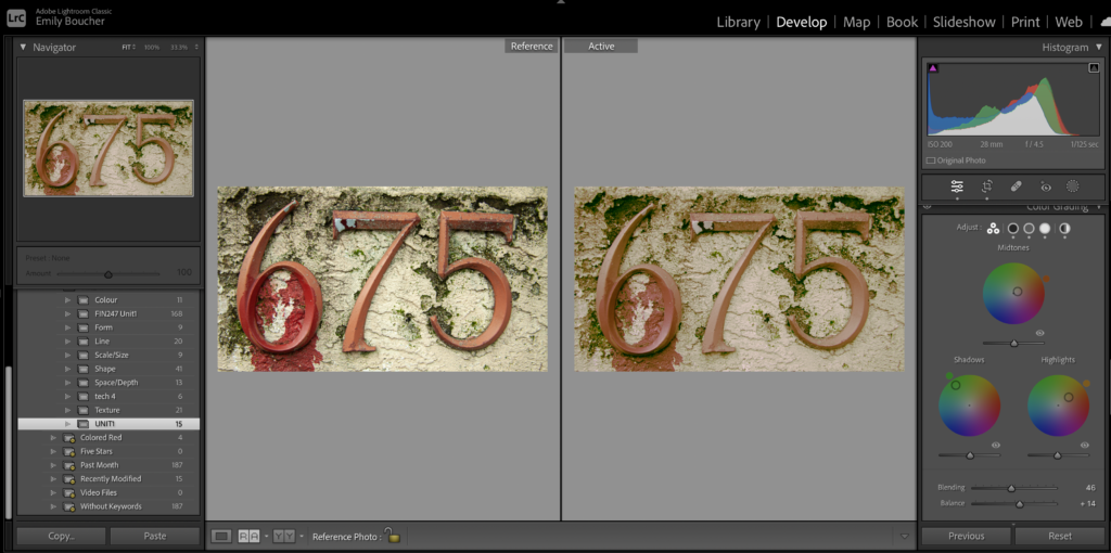
Texture:
I used the black and white method as described in Theresa Jackson’s tutorial. I first changed the image to B&W and started playing with the colour grading settings. I applied green to the shadows, orange to the mid-tones, and an orange-yellow to the highlights. I Increased the balance and sharpening. I adjusted the red, green, and yellow input/outputs using the tone curve. When I turned off the black and white basic settings I was left with a nice matte image. I reduced the highlights and shadows further in the HDR setting prior to completion.
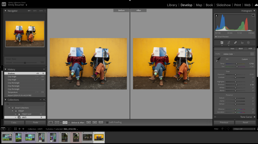
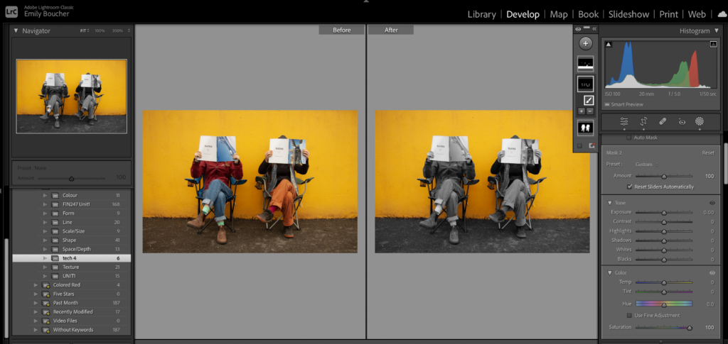
Colour
I used the Masking technique to remove saturation from the people and made improvements to the selection with the brush. I increased the vibrancy of the background using basic adjustments with hue, tint, temp, and shadows.
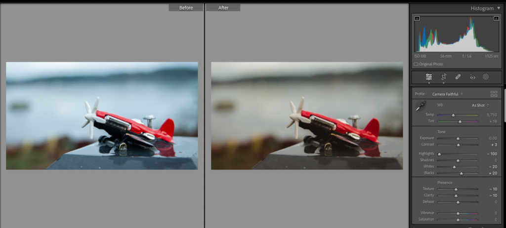
Size/Depth
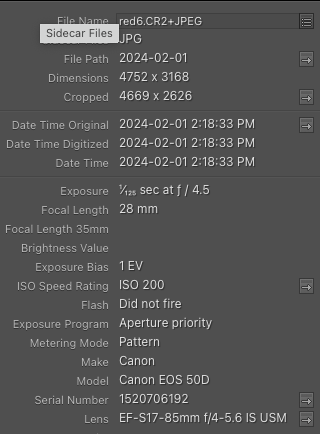
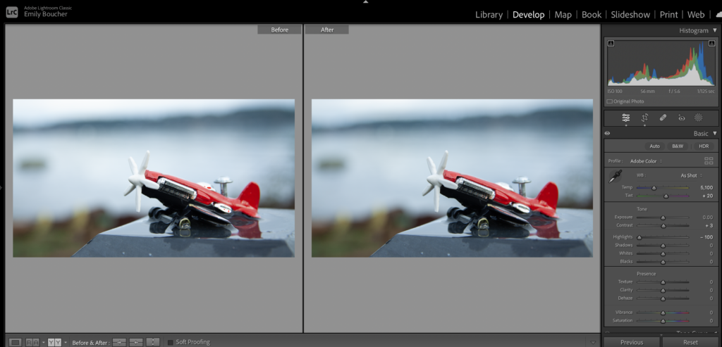
I started with browsing the camera profiles, where I chose Faithful to start. I played around with the temperature, tint, highlights, blacks, whites, and texture/clarity to get the final result.
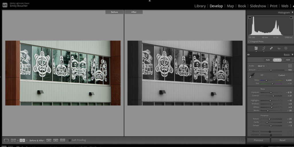
Shape
I started with a B&W12 Profile, then proceeded to adjust the basics to make the shapes really pop out off of the glass.
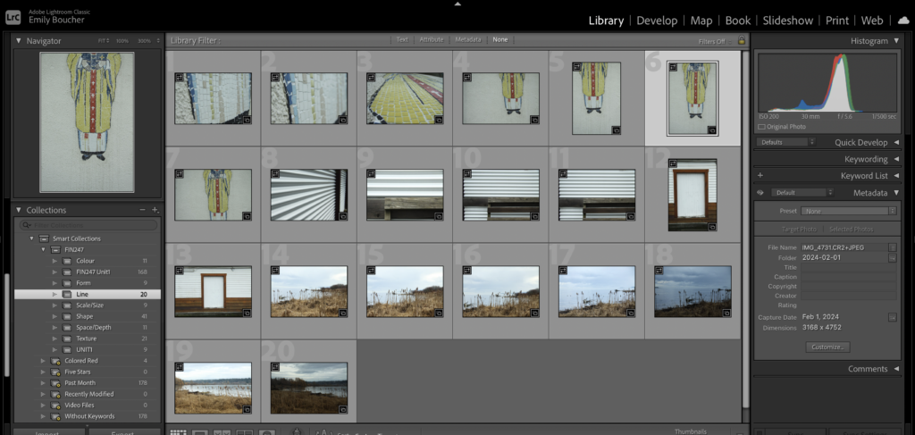
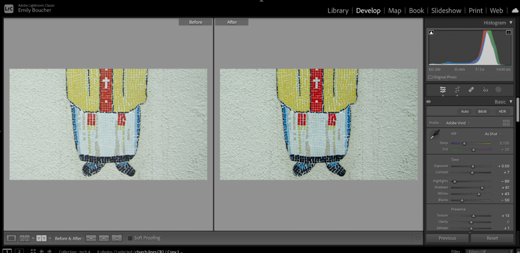
Line
I started with the profile of Adobe Vivid which gave life to the colour in the tiles. I wanted to emphasize the lines and grooves so I bumped the contrast, dropped the highlights, increased shadows and whites and dropped the blacks while increasing texture. I popped it into B&W and then adjusted the yellows and reds to get more colour after reverting it out of B&W. The changes are not too intense, while still making the colour, texture, and line pop.
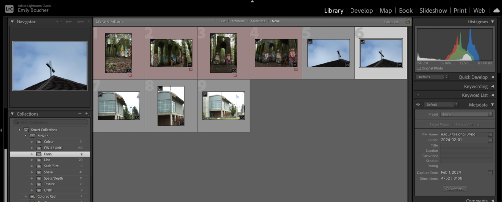
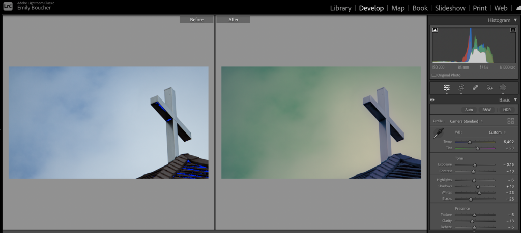
Form
I wanted to have a dooms day, Johnny Cash vibe for this one so I played around with masks and hues to get the hazy sky without packing in too much black and white. I actually really liked the outcome!
Space
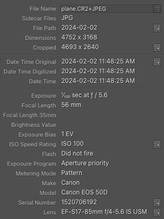
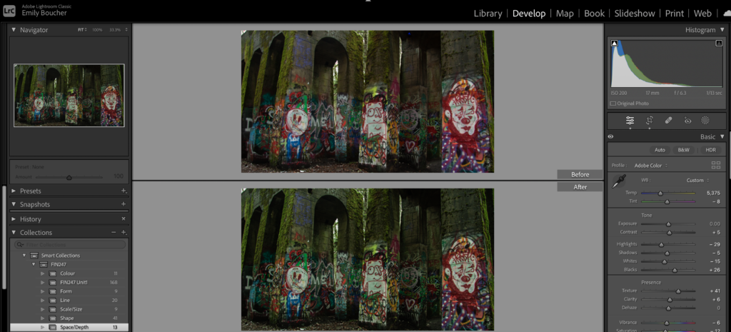
I started with the Artistic01 profile and then worked to bring out the cooler tones of purple and grey to allow the concrete to stand out.